post lux
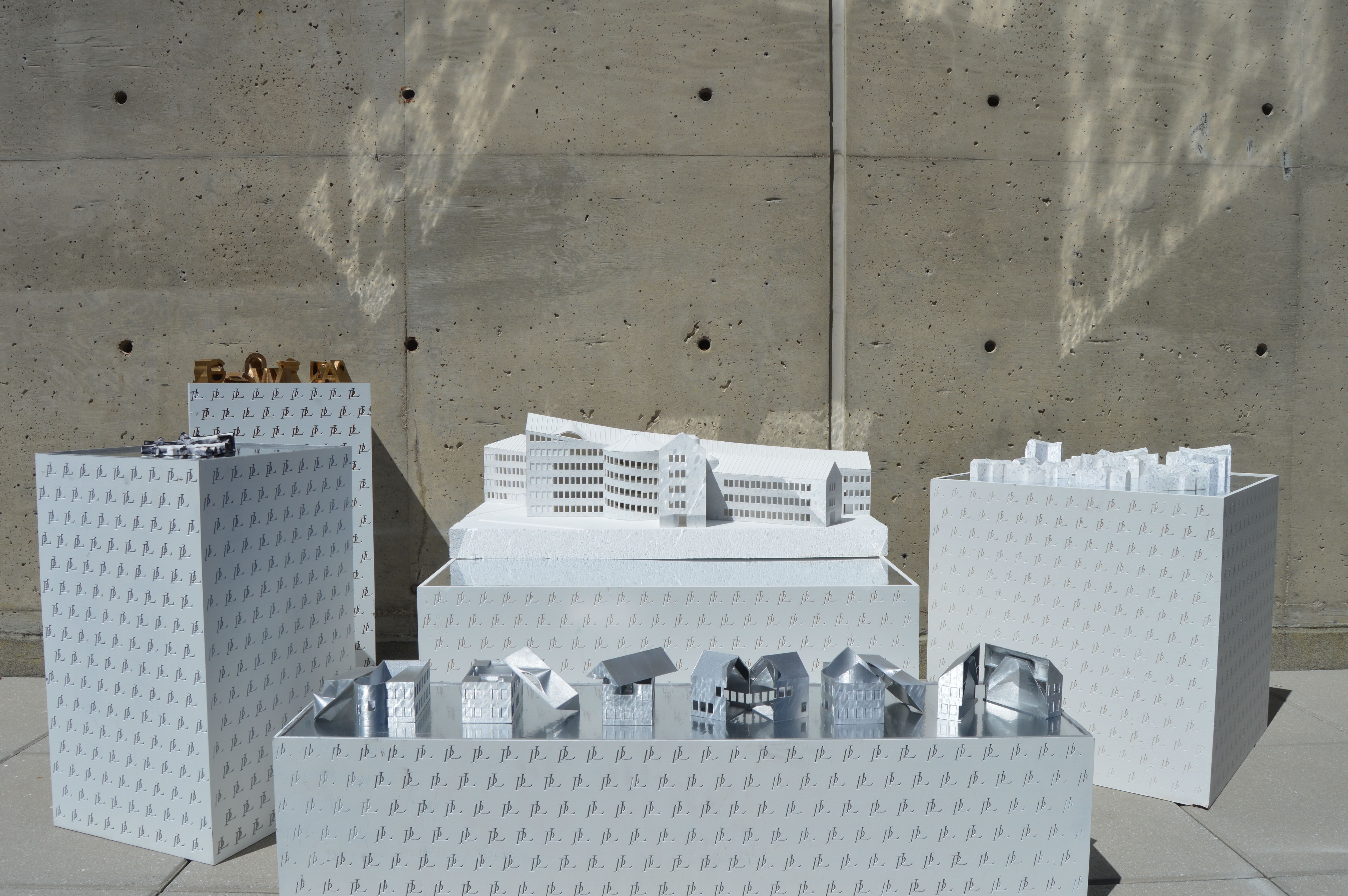
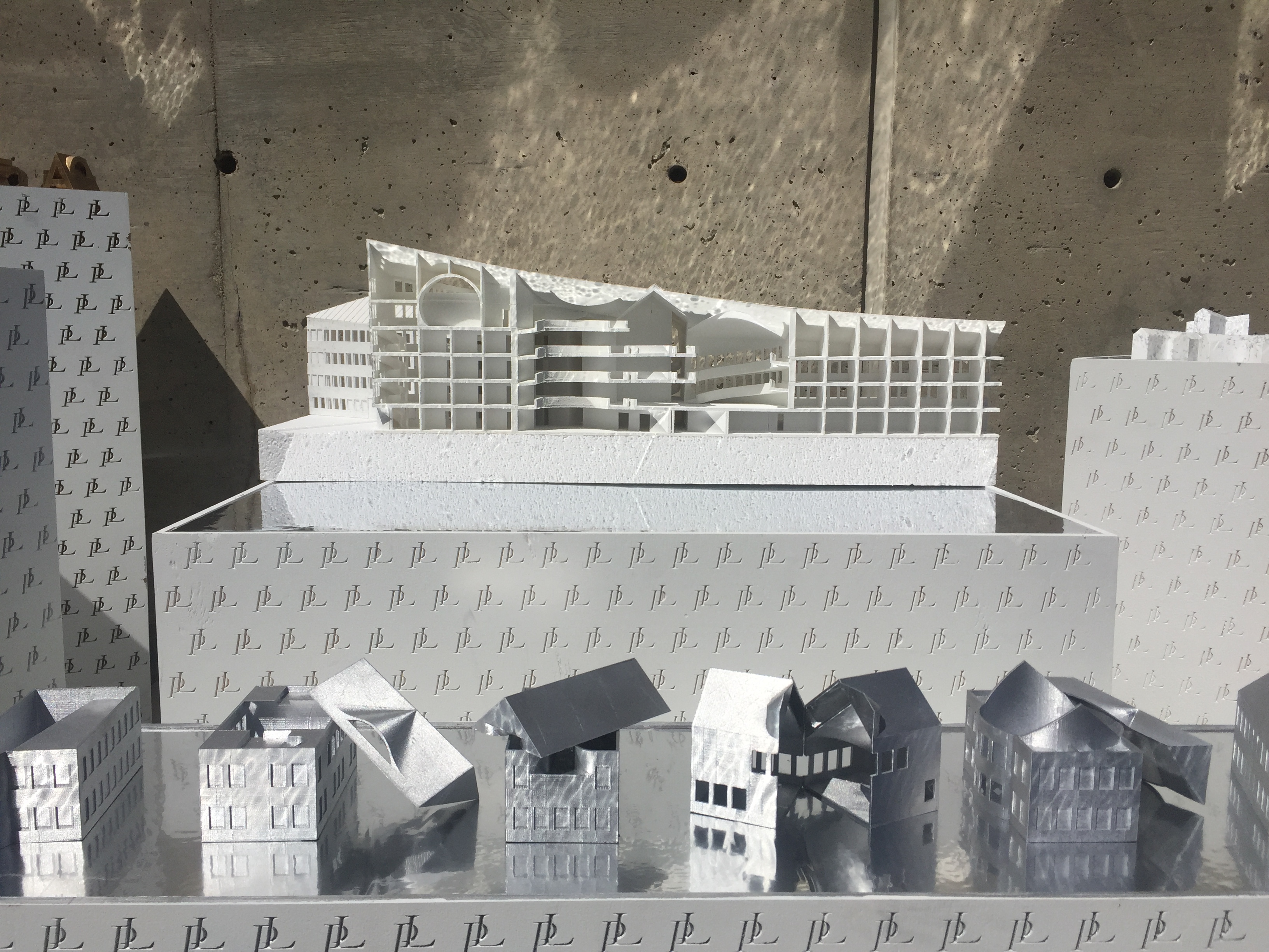
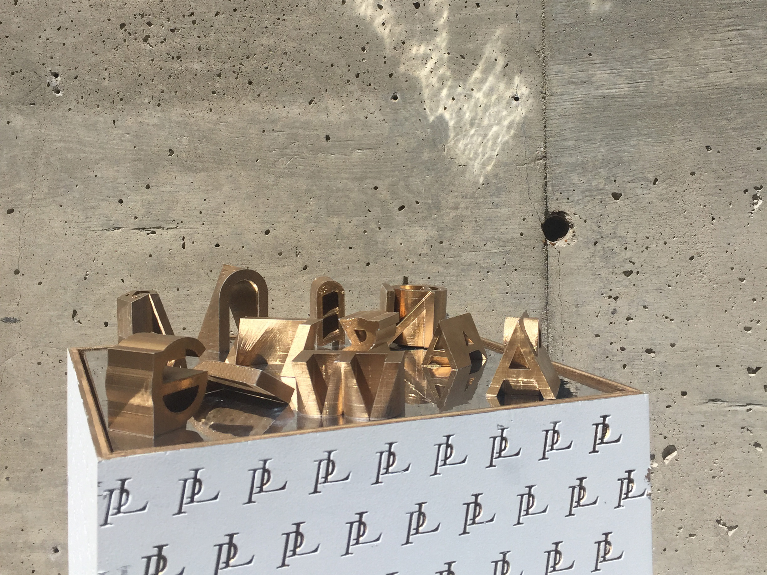
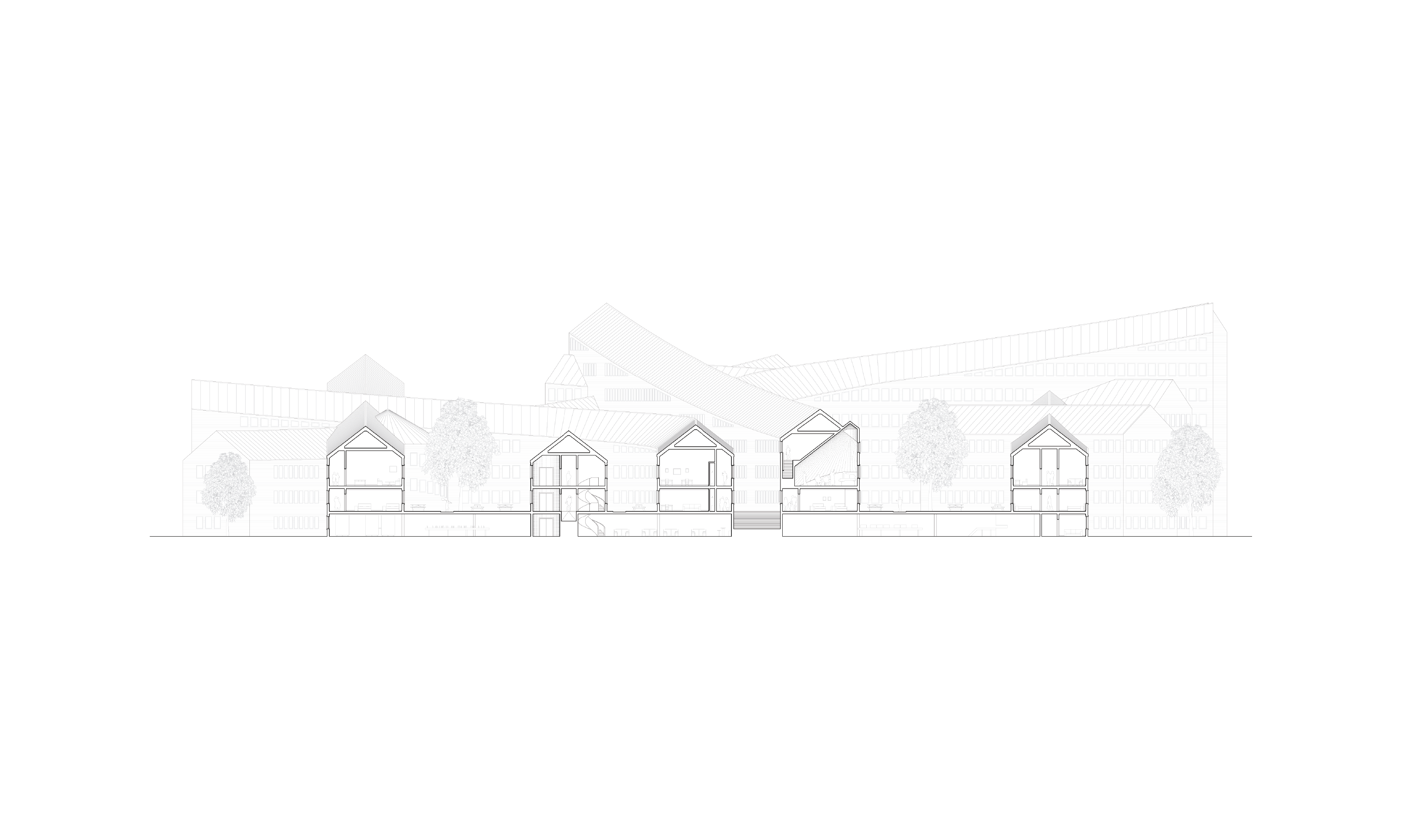
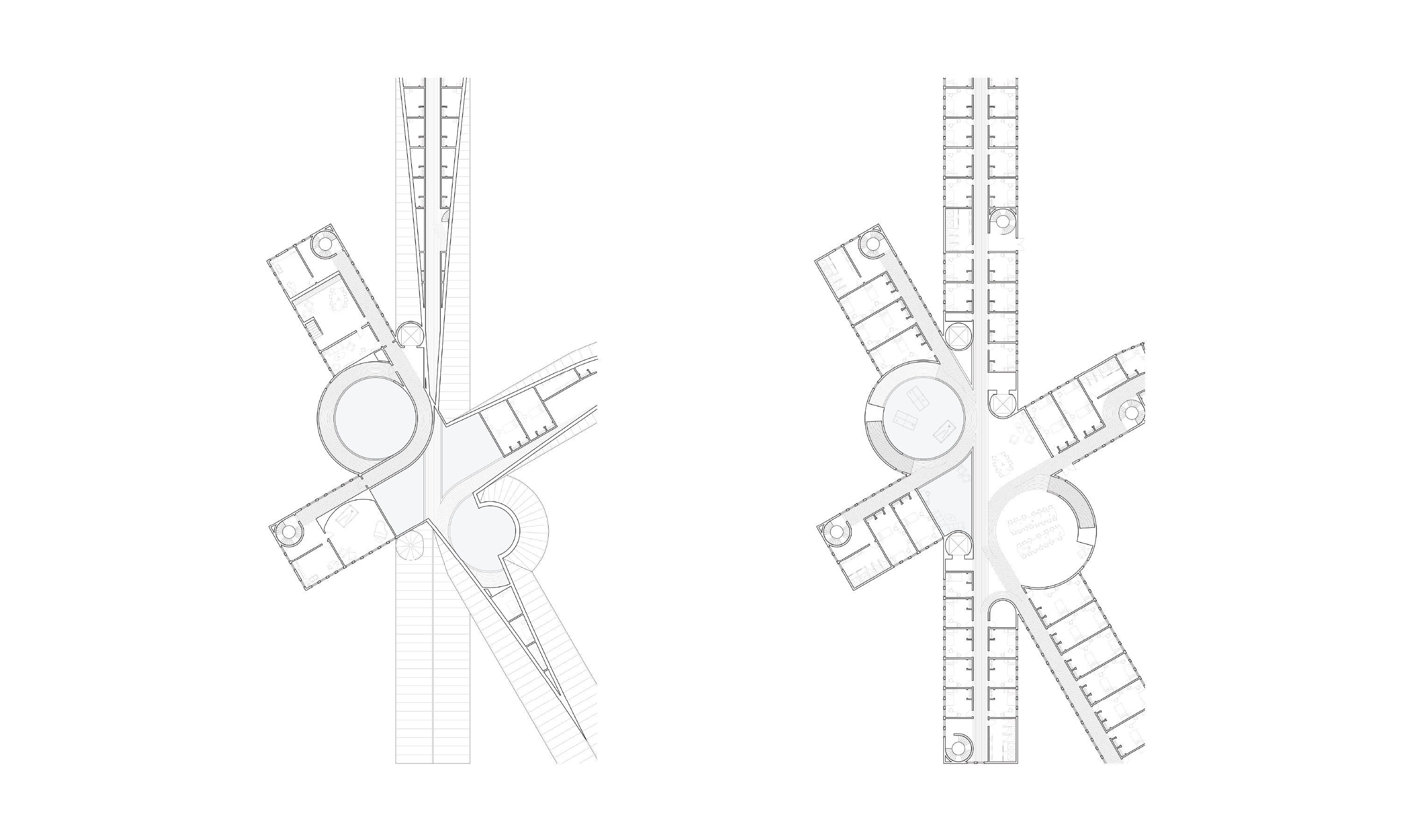
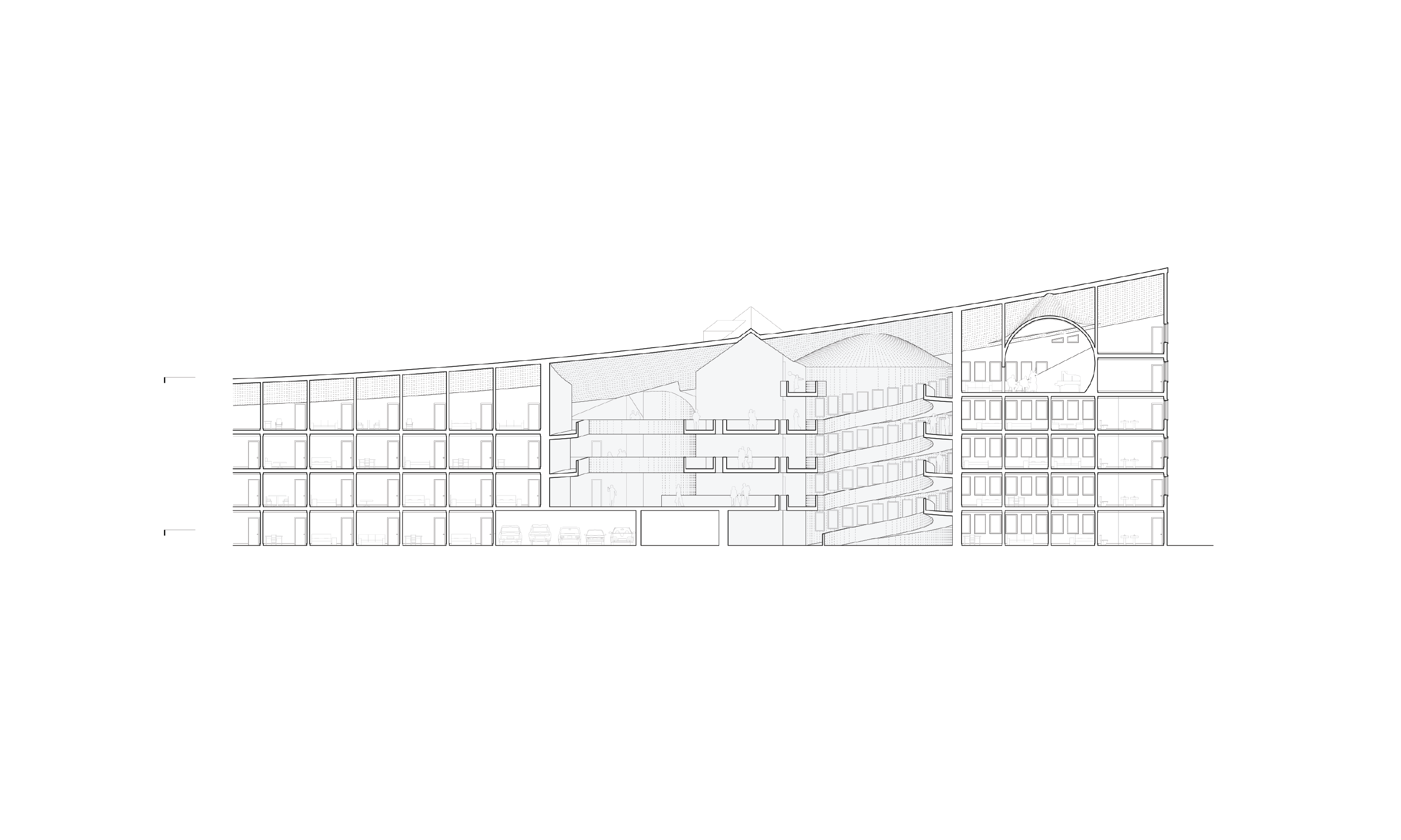
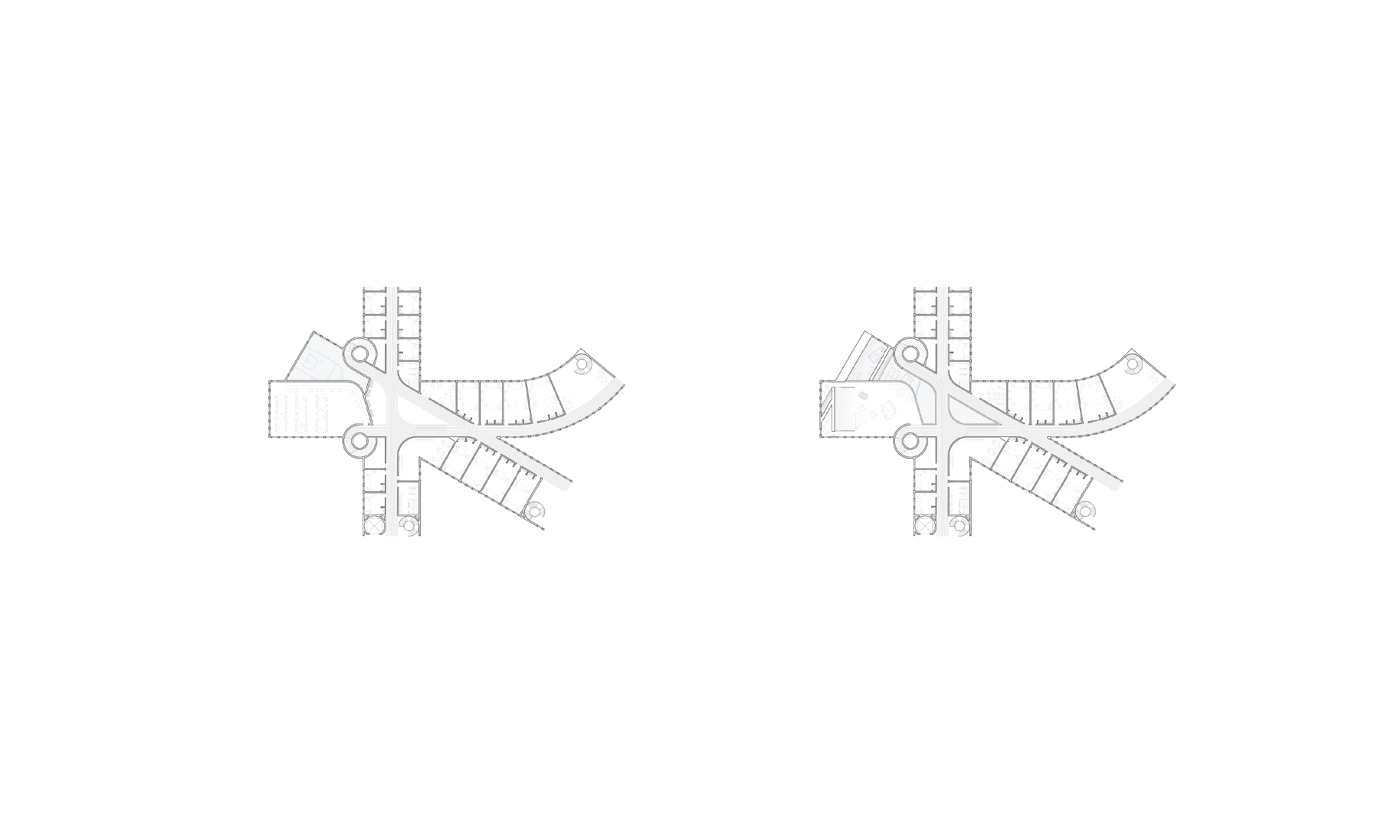
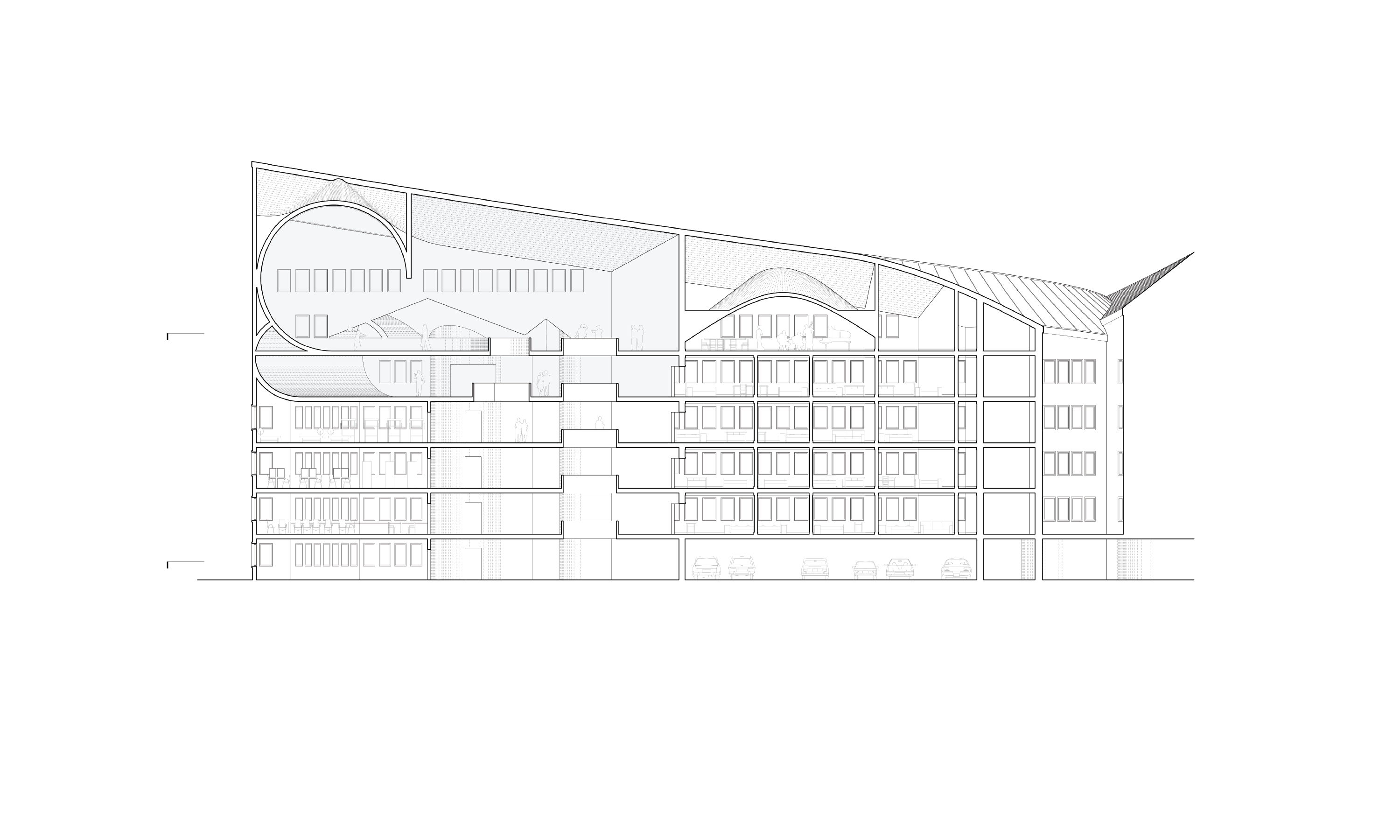
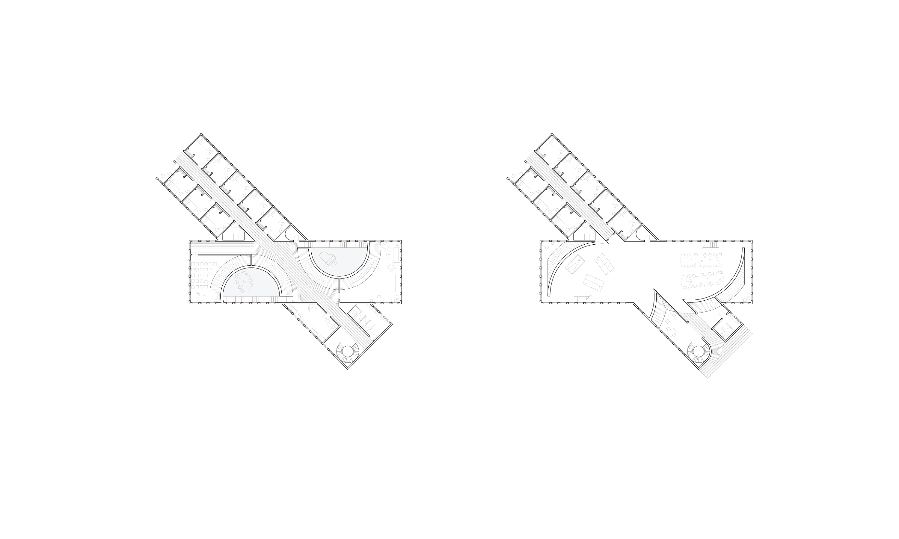
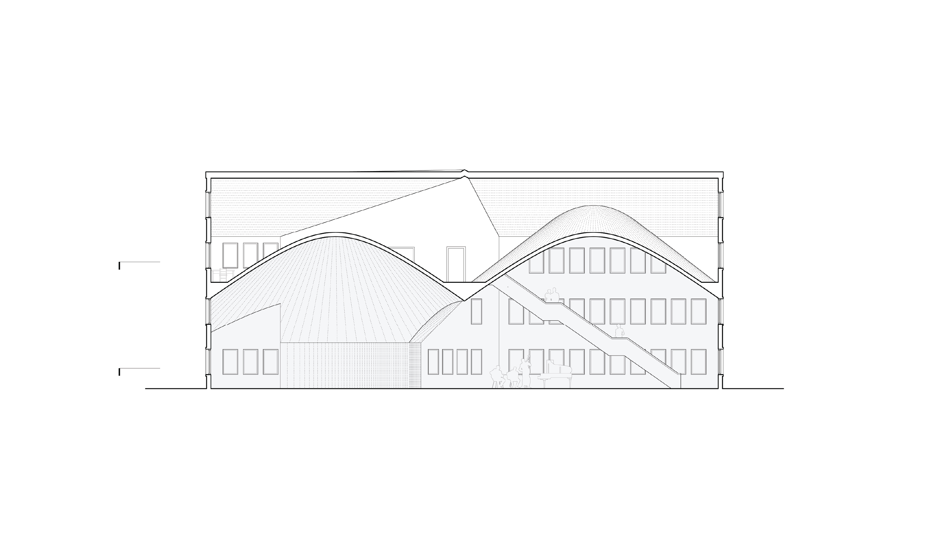
The project drew on typography as a design framework, translating the contrast between serif and sans serif fonts into a mixed housing scheme in Somerville. Student housing formed the baseline condition, while controlled serif-inspired insertions introduced moments of luxury within a predominantly collective fabric. Typographic elements informed massing, façade articulation, and interior organization, using ornament to suggest spatial complexity without disrupting the urban context. The project positioned architecture as a form of letterform, where façade and geometry mediate between efficiency and exception within the contemporary housing landscape.
type
academic | core iv
client
design team
Brayton Gregory & Willem Bogardus
location
Harvard GSD
date
2019

No items found.